A Quick Overview By H. Dietz
Earlier this year, Microsoft made an interesting announcement concerning a "300% improvement" in image quality for text on color LCD displays by using subpixel rendering. This potential improvement is based on the fact that conventional (non-projection) LCD displays actually separate Red, Green, and Blue for each pixel. Theoretically, by separately controlling the three color elements of each pixel, one can achieve higher resolution. See the Reference Material at the end of this page for a better introduction to the ideas and their applications.
I've seen nothing technical from Microsoft about how they intend to enhance their display, but there has been quite a fuss over this "new" technology relative to the fact that old Apple computers also used "subpixel rendering" techniques. Fair enough. Back around 1982, I designed and built a CAI system that used these kinds of tricks for display on Apples (how else could you get around the demented Green/Violet or Red/Blue color encoding?). Anyway, the basic concept of display elements being able to show only a restricted set of shades or colors is at least as old as the concept of a pixel, and probably older.... Only the quirks of LCD displays might lead to some new software requirements and designs, so here's my application of standard engineering practice (i.e., non-patentable) technique for making use of LCD subpixels. I'm posting this on the WWW simply to ensure that no company can patent these obvious, but perhaps useful, methods.
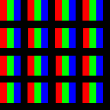
The quick answer is that they typically look like this:
In summary, each display pixel on a typical color LCD panel is a thin vertical stripe capable of displaying only between 8 and 32 distinct shades of one of Red, Green, or Blue. These stripes are arranged in a regular matrix, roughly as shown above.
Actually, I wasn't aware that they look that way until last week, when a friend mentioned the R-G-B striping to me over lunch. The reason I wasn't aware of it was that the gaps between pixels (the shadows of the drive circuits and wires) were so much more visible that I never noticed the tightly-abutted lines of color within each pixel. The black lines are significant in that they cannot have their color changed, yet they take space. Getting as close as possible to the right colors in the right places is what image display is all about.
In general, the correct way to handle these strange display pixel placements and shading constraints is to accurately model them and to computationally adjust the image to compensate for these "defects." These models can get very complex; for example, there are lots of sophisticated hardcopy printing display pixel models that try to account for ink bleeding, etc. Any "subpixel" approach is really nothing more than a crude, but computationally cheap, way of modeling display pixels.
For the moment, let's ignore the black spaces between compound-pixels, so that the pixels are modeled as densely-packed 1x3 stripes. Let us further assume that the image pixels have the same pixel aspect ratio as the display pixels; if they don't, one could simply resample/interpolate to that pixel aspect ratio. The simplest reasonable model for the LCD subpixels is that each is given the value of the corresponding color component of the image pixel that occupies the same space. This yields some improvement, but also yields some color fringing.
Now you cannot really see the effect on a CRT, and it is hard to see the details on an LCD, but here's the basic result for white text on a black background:
 By compound-pixel smoothing
 By subpixels
The above images are enlarged compound-pixels; note that the subpixel order is R-G-B for my LCD panel, so a red pixel is on the left side of a compound pixel, etc.
The subpixel text is significantly more readable in the sense that the full 3x horizontal resolution is being used, but we have clearly sacrificed some color fidelity. There is severe color fringing at many edges within the image. However, some of the text doesn't have color fringing around it, and that leads us to three primary classes of potential fixes:
At this time (December 15, 1998), I have implemented a couple of variations on the second approach. All of the examples were screen grabs from implementations in the public-domain Linux Video Wall support package that I've been developing (see http://garage.ecn.purdue.edu/~papers/). Here are some results for the same white text on a black background:
 By subpixel smoothing (preserving color)
 By subpixel smoothing
IMHO, the second is a slightly better trade-off of placement versus color accuracy. The algorithm it uses is simply that the value for each subpixel is the weighted-average of the values of that color component for each of the neighboring subpixel ideal colors (even if they are not in the same compound pixel). In particular, the weighting used is 50% the value of this color channel for this subpixel + 25% of each of the same color channels for the subpixel before and the subpixel after (which, of course, cannot display any of that color channel).
An interesting additional benefit is that the subpixel
smoothing seems to slightly improve quality even when using a
CRT... hmmm.... It shouldn't.
Reference Material
This page is just my $0.02 about the whole issue, but I'm not really an expert in this stuff. Here are a few good background pointers.
There is an article about Microsoft's announcement at http://www.pcworld.com/pcwtoday/article/0,1510,8947,00.html. BTW, Microsoft's name for this stuff is ClearType, and they seem to be intending to use it only for font rendering....
The best overview of subpixel text rendering is at http://grc.com/cleartype.htm. When I last looked at it, there wasn't yet an algorithm or code to remove the color fringes (the author of the site was still working on that), but all the basics are explained quite well. There are even some magnified screen photos showing an actual LCD display with and without subpixel rendering.
I wonder how long it will be before Linux consoles and XFree86 adopt subpixel techniques as an option for font rendering and for general graphics.... ;-)

This page was last modified December 15, 1998.